DVP Enterprises provides you with the creative
design and damn good websites
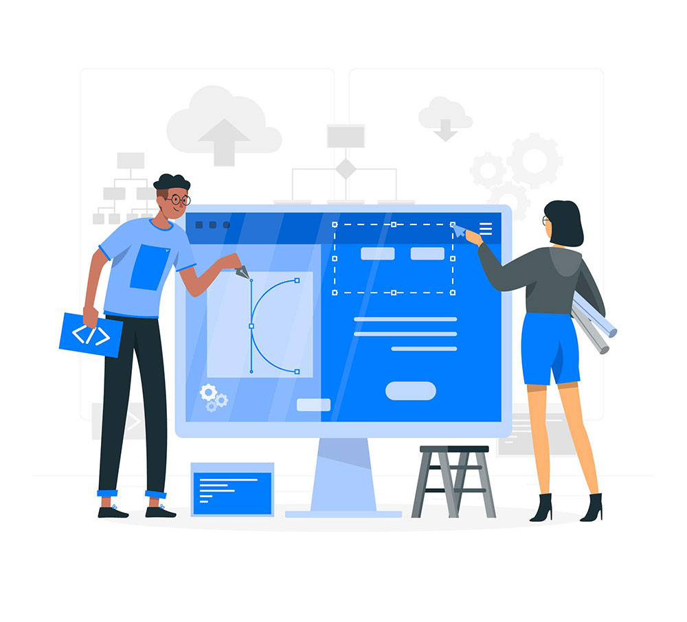
Responsive Website Design
A responsive website is one that can be viewed on any type of device and browser without any loss of structure or content. Increasingly, people are accessing the internet on mobile devices which have differing screen sizes and resolutions. Devices have different memory configurations, operating systems and browsers. This also has an impact on load times of websites. Responsive website design techniques aim to address all these challenges. At DVP Enterprises, our responsive web development services ensure that your business website will always be easily and fully accessible to your customers and website visitors, regardless of the device they access it on. We use fluid grid, flexible grid and responsive images to ensure website doesn’t shrink based on screen but remains proportionate and easy to read. Responsive web design provides a cost-effective means of designing websites because you don’t need to create separate sites for different devices, test each, deploy each and maintain each website. It is one website that has to be set up, deployed and maintained. There are other business benefits too.